UPM's typography style is designed to be clear and minimalistic, perfectly complementing bold statements and photographic backgrounds. Different typesettings are chosen for various usages to ensure clarity and visual appeal. Adhering to these guidelines is essential to maintain the integrity of our brand and present a cohesive image.
Typography
Typefaces
Mona Sans is our primary identity typeface for all Latin script. It is used for most applications and creations, both for print and digital. Mona Sans is designed as a variable font. To ensure consistency in our brand materials, we have selected five weights, ranging from Light to SemiBold. It is our primary choice for headlines, subheadlines, body text, links and buttons.
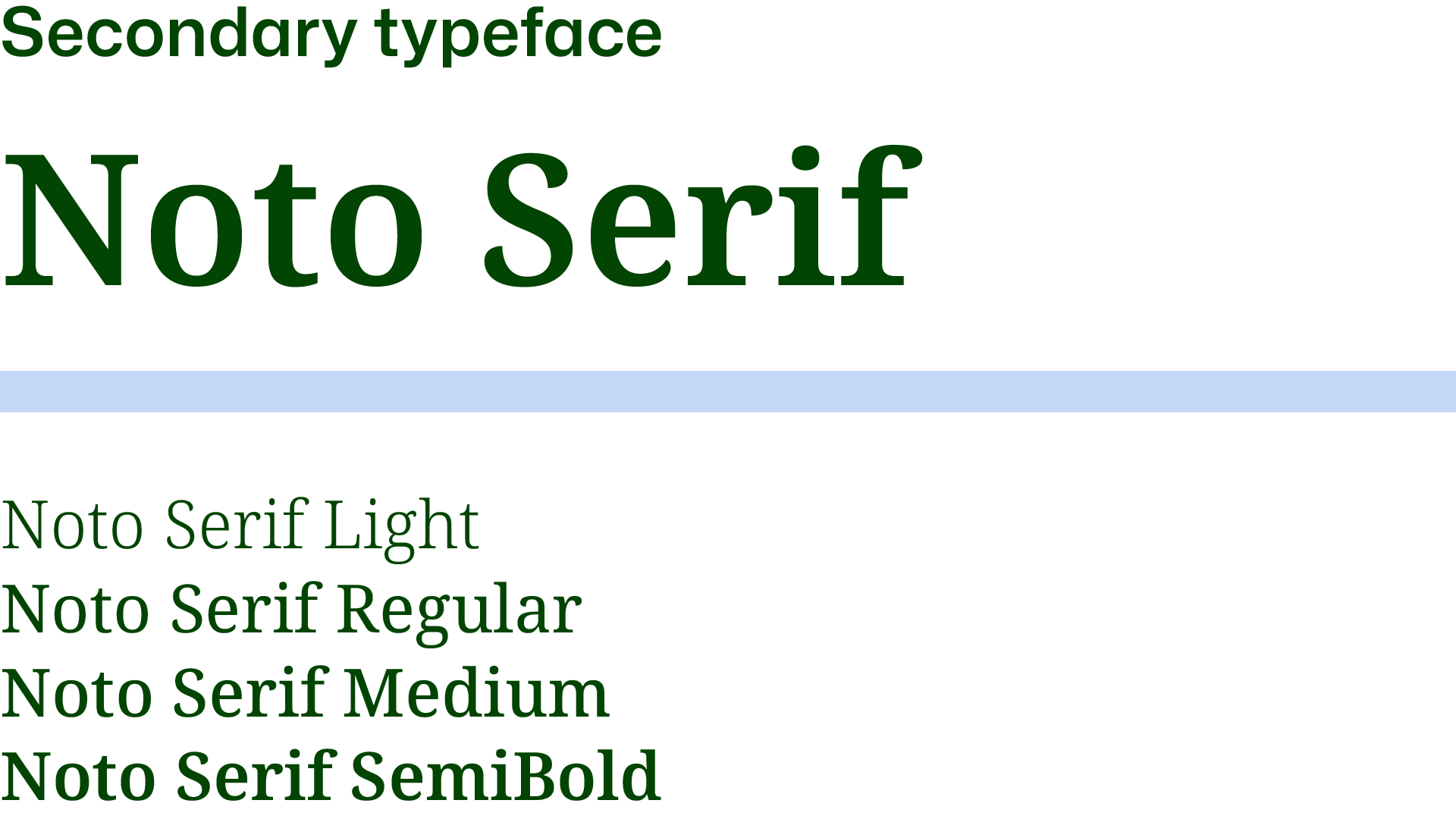
Our secondary typeface is Noto Serif. Use it only for longer body texts in content-heavy layouts such as magazines, reports and corporate publications.
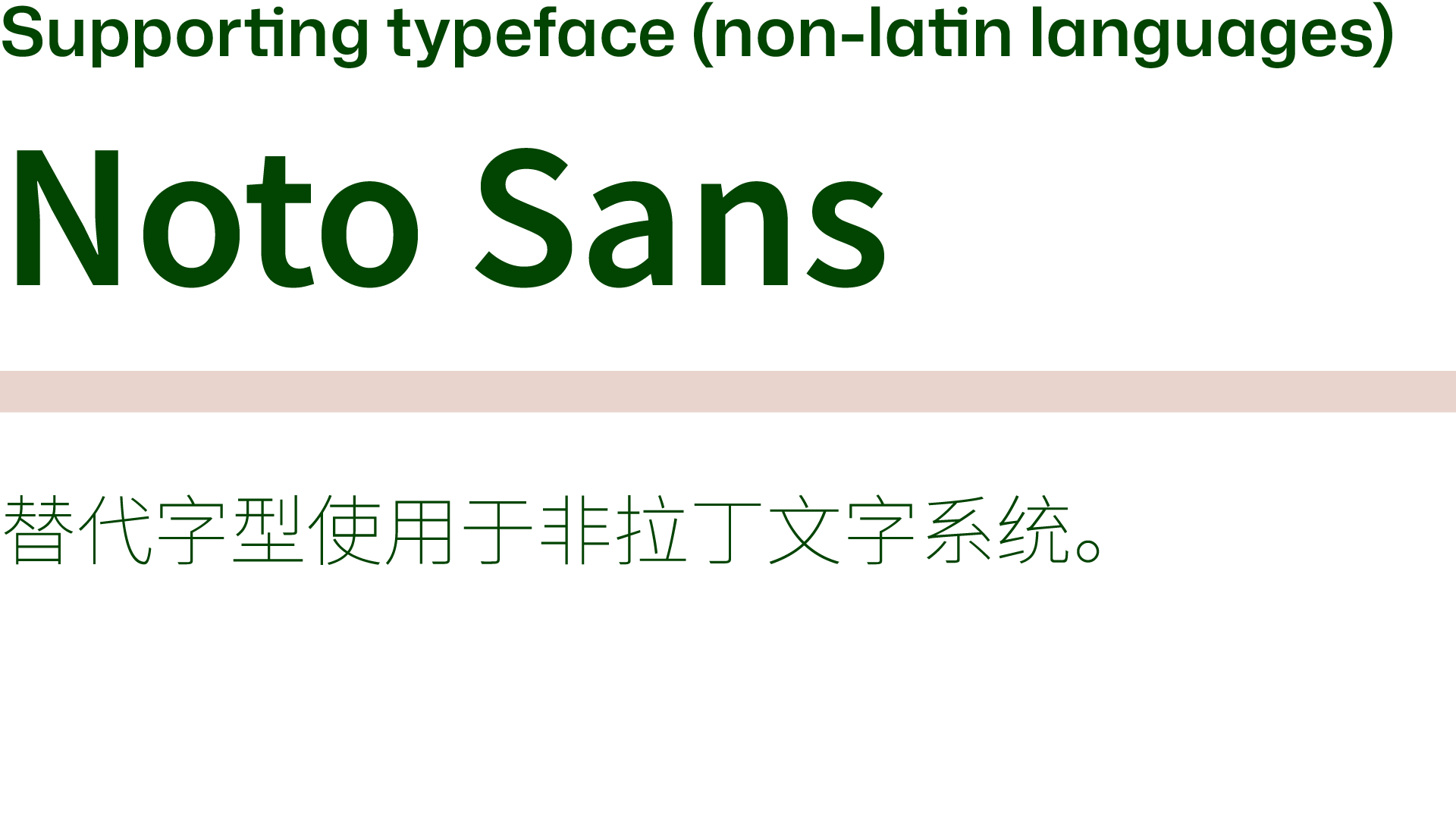
The Noto Sans typeface works as a replacement for Mona Sans, when non-Latin scripts are needed. It provides full support for Japanese, Korean, Chinese (Traditional and Simplified), and many more.
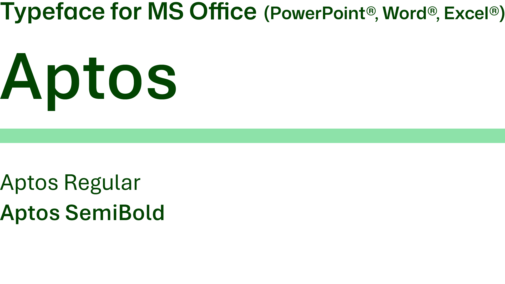
Aptos is a sans-serif, default typeface for Microsoft 365 suite (PowerPoint®, Word®, Excel®). Aptos includes characters from Latin, Greek and Cyrillic scripts. We use Aptos Regular for body text and Aptos SemiBold for headlines and titles.
Typesetting
When working with typography in our brand communication, we adhere to a clear and consistent style. We use sentence case capitalization to maintain a straightforward, approachable tone and intentionally avoid uppercase letters, favoring a more natural and inviting appearance.
All content is crafted using American AP (Associated Press) English, ensuring clarity and correctness. For a clean and easy-to-read layout, we align all text to the left, promoting a structured flow of information. Ligatures are avoided to keep the text visually clean and legible. Lastly, when sharing URLs, we exclude "www" to maintain a modern, streamlined look.
Typesetting
Sentence case capitalization is the preferred style, and uppercase letters should only be used when absolutely necessary. Always use left-alignment for text. Headlines should be no longer than 3 lines, and no more than 2 text colors within a single layout. The size of text will depend on the format, text length, and layout. Always follow the established hierarchy and apply the appropriate font weight, leading, tracking, and padding as specified.
A double margin (2A) can be used from the left edge in brochure covers, magazine ads, or large-format printed materials to improve clarity. Padding (x): The space following a headline is equal in height to one line of headline text.
Examples:
Headline size is 50 pt, leading is 50 x 1.1 = 55 pt
Subheadline is 24 pt, leading is 24 x 1.2 = 28.8 pt
Body text is 12 pt, leading is 12 x 1.3 = 15.6 pt
Headline
Mona Sans SemiBold
Sentence case
Leading: 1.1 (110%)
Tracking: default (0)
maximum 3 lines
Subheadline
Mona Sans SemiBold
Size: 40% of headline
Sentence case
Leading: 1.2 (120%)
Tracking: default (0)
Body text
Mona Sans Regular / Medium
Sentence case
Leading: 1.3 (130%)
Tracking: default (0)
Button
Mona Sans SemiBold
Rounded shape filled or outlined Sentence case
Link
Mona Sans SemiBold
URL written without www
highlight with the color
Quotation mark
Mona Sans SemiBold
Glyph
GID: 628
Unicode: 201C
Name: Left double
quotation mark
Signature
Mona Sans SemiBold
Title Case
highlight with the color
Brand promise styling
When UPM's brand promise in used as a visual element in advertising, marketing or branding materials, we recommend to use the same typesetting for recognition and brand alignment. When used in text, follow the rules mentioned in the Brand foundation section.
The brand promise "We renew the everyday" is written in Mona Sans SemiBold, set in two lines, with 1.1 leading and default tracking (0). If there is not enough space or it does not fit the design, setting it in one line is allowed.
Note: There are no specific rules for positioning UPM's brand promise in a layout, but always make sure it is clear, visible and not distorted by other graphic elements. As for the colors, the same rules apply as for all typography.
Usage of colors
Colors for typography follow the same rules presented in the color pairing section based on the WCAG system. This is extremly important to stick to these rules, especially in text, to ensure the best readability and accessibilty. Color usage cheat sheet: use the Reliable color for the text placed on the light color backgrounds (Energy, Transparent, Renewable, Innovation and Growth). Use the Transparent color on a Trust background or dark-toned image. We use Transparent instead of white for text.
Note: UPM logo is always white on a dark background or image.
Use text on even-toned images only when readability is sufficient. Always ensure adequate contrast between the text and background for optimal visual impact and legibility. In other cases, use a solid brand color background for the text. Do not place text on the image when it is too busy and disrupts readability. Use a color background instead and combine it with the image on your layout.